Book Design14 March 20262 min read
The cover is not decoration
A book cover has one job at 40mm wide on a phone screen, another at arm's length on a table, and a third in the hand. Most covers are designed for only one of them.
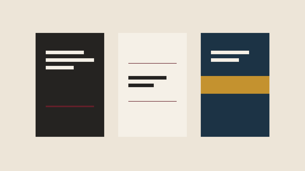
A cover is not a picture attached to the front of a book. It is a piece of functional design that has to work at three completely different sizes, in two completely different media, for two completely different readers.
The thumbnail
The first place almost every book is now seen is a retail listing, roughly 40mm wide, next to eleven other books. At that size, an image is a smudge and a subtitle is a grey line. What survives is contrast, one strong shape, and the title if it has been set large enough.
This is why so many good covers are type-only. It is not minimalism as an aesthetic position. It is the only thing that reads at 40mm.
The table
The second is the front table or the shelf face-out, where the reader is three feet away and deciding whether to pick it up. Here the cover has to communicate category before anything else. A reader can tell a literary novel from a thriller from a business book from across a room, and they do it in well under a second, using signals nobody consciously catalogues: typeface, colour temperature, how much of the cover is empty, where the author's name sits, whether there is a rule under the title.
Getting this wrong is not a matter of taste. A memoir dressed as a business book will be picked up by people who do not want it and skipped by people who do.
The hand
The third is the object itself. Weight, the give of the board, whether the lamination is matt or soft-touch, whether the title is blind debossed so you find it with a thumb before you read it, whether the spine is square and the book opens flat.
This is the part that cannot be judged from a PDF and is the single most common reason a first-time author is disappointed by their finished copies. The file looked right. The object was never specified.
What we ask before designing anything
- What are the three books this one will sit beside?
- What is the reader expected to already know?
- Is this a book someone buys for themselves or is given?
- Is it a single title or the first of a list?
- Will it be read mostly in print, mostly on a screen, or given as an object?
The answers change everything: the trim size, the extent, the paper, whether there is a jacket, how the title breaks across lines.
And one thing we do not do
We do not present twelve cover routes. Twelve routes is not generosity, it is a designer declining to have a point of view and asking the author to art-direct by committee. Two or three considered directions, each with an argument behind it, produces a better book and a shorter argument.